- Native Android application for the patient's tablet.
- A mobile cross-platform application on Android and iOS with two personal cabinets: for the patient and the caregiver.
According to the idea of the company, the device should help patients take medications on time and monitor their condition. Due to this decision, it will become easier for the caregivers and medical staff to take care of their wards, and the effectiveness of treatment will increase.
We needed to develop several applications with different functionality.
For the patient — a native launcher application for Android on a tablet:
For the caregiver — a cross-platform mobile application:
Initially, our task was to create an interface that would be convenient and understandable for older people. The design for the elderly has its own peculiarities, because of which the UI can look quite specific.
Such interfaces should have high contrast, minimalism and ease of perception. It is worth using large fonts and elements, text explanations for icons, visual cues and simple navigation.
During the discussion of the resulting layouts with the customer, we came to the conclusion that the stated concept needs to be revised. The idea to make an interface tailored to an age audience did not meet the expectations of providing users with a modern and complex UI. To some extent, these are mutually exclusive things, so in the end we decided to make a choice in favor of the visual component, sacrificing some narrowly focused UX solutions.
Having received a brief description of the application logic, we began to work out the technical requirements. At this stage, the client-server architecture was defined, taking into account the addition of new functionality in the future. We also took into account the future need for scaling, having laid out the functionality in advance for its rapid implementation.
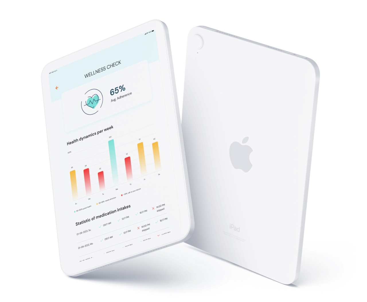
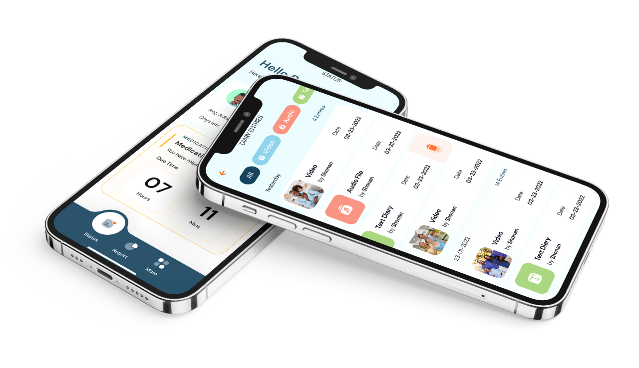
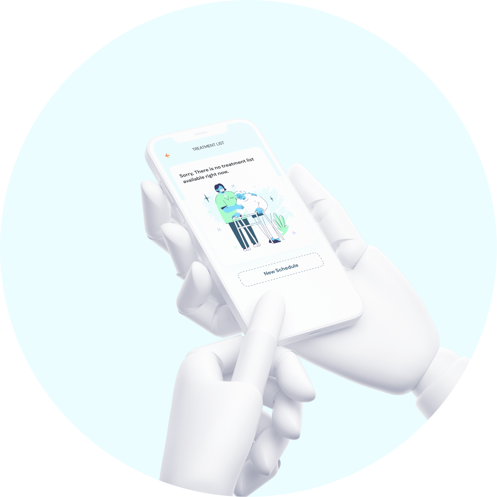
Pria described a new design vision, and we received ready-made layouts and strengthened the customer's ideas: we closed gaps in logic, adjusted some screens, added new ones. In the final, a visual concept was born that tells users a story about care and attention. The company's designers used friendly characters in the illustrations, soft color solutions and typography, which complemented the desired associative series.
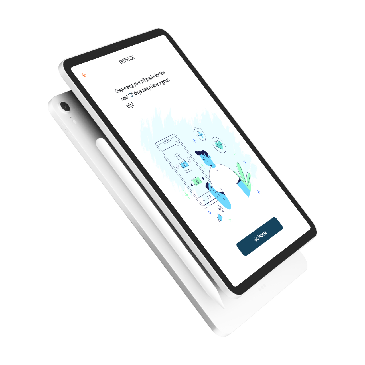
Initially, the device on which the application was planned to be installed had to have a screen and a dispenser that dispensed pills using the "pill pack" system. With this approach, all the necessary medications are sorted into special bags and divided by day and time of intake.
However, after receiving feedback from potential customers in the United States, it was decided to remove the mechanism for issuing pills. It turned out that such a system is unusual for users, and the device began to be a tablet without a dispenser.
We needed to develop a native launcher application, i.e. a unique user interface for an Android tablet. During the work, we replaced parts of the system interface with elements of the application itself, so that the patient could control important functions: change brightness and volume, connect to the Internet, etc.
One of the most interesting tasks was the implementation of updates for the application. It was not possible to log in from the launcher to the store and download the new version, so we used OTA technology (over-the-air, "by air"). This method implies the presence of a server module on which new versions are stored, as well as a system built into the tablet that allows the device to understand that an update has appeared. It is enough for a patient to press one button in the application to install the new version on the tablet.
In addition to the native application, the customer wanted to create an application for mobile devices. We decided to perform this task using the Flutter framework, which is easy to develop MVP. At the exit, we received an application for iOS and Android at once.
The mobile application partially duplicates the functionality of the native one. We have developed two personal cabinets: for the patient and the caregiver. The caregiver can view the patient's treatment status:
The mobile application also displays statistics on medication intake. To facilitate the registration process and scheduling, the caregiver has the opportunity to do all this for the patient.
The application for the system device and the mobile application are closely related: if a patient takes medicine or skips it, push notifications are sent to the caregiver on the mobile application.
Testing began at the stage of obtaining design layouts and continued throughout the work. And when the requirements became sufficiently complete and consistent, the tester compiled functional tests covering the initial data.
The test documentation was conducted using our own development — the DoQA test management system.
500
assigned and completed tasks
1000+
test cases
225+
detected and corrected defects
PHP Developer — 2 people
Android Developer — 3 people
Flutter Developer — 1 person
Designer — 1 person
Project Manager — 1 person
Testing — 1 person